👩🏼⚕️ NEON Assist
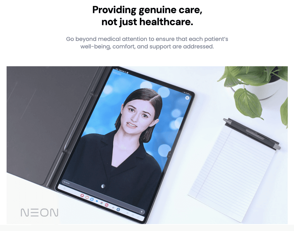
Designing a virtual human assistant that provides a smooth meal ordering experience for hospital patients.
Timeline
2 months
The Team
1 product designer
1 project lead
1 visual designer
My Role & Goal
Solo product designer
Pitch the the concept to potential customers
Collaboration
2 visual designers
head of design
What
A virtual meal ordering assistant
Who
Patients staying overnight in hospitals
How
Empathetic and human-like interactions
Impact
Increased patient's satisfaction and overall experience
CONTEXT
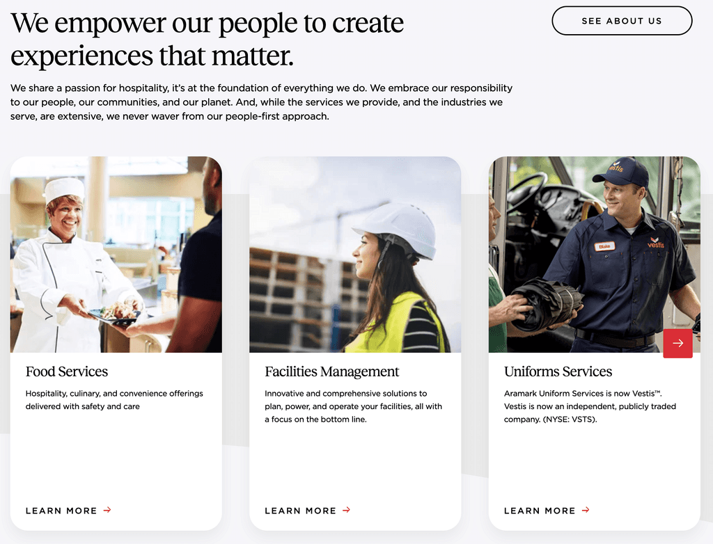
NEON Assist x Aramark Healthcare
Aramark delivers both inpatient and outpatient dining solutions.
They approached us in search of a cutting-edge solution for patient dining. Their hospital offerings span services like patient sitters and reception.
CURRENT SOLUTIONS
No one likes to wait 2 hours to order their food 😡
There are two current solutions, however, neither is an efficient solution for the hospitals.

Manual Order
Patients order over the phone
Patients order face to face when nurse in the room
Patients post their orders outside the door to be collected
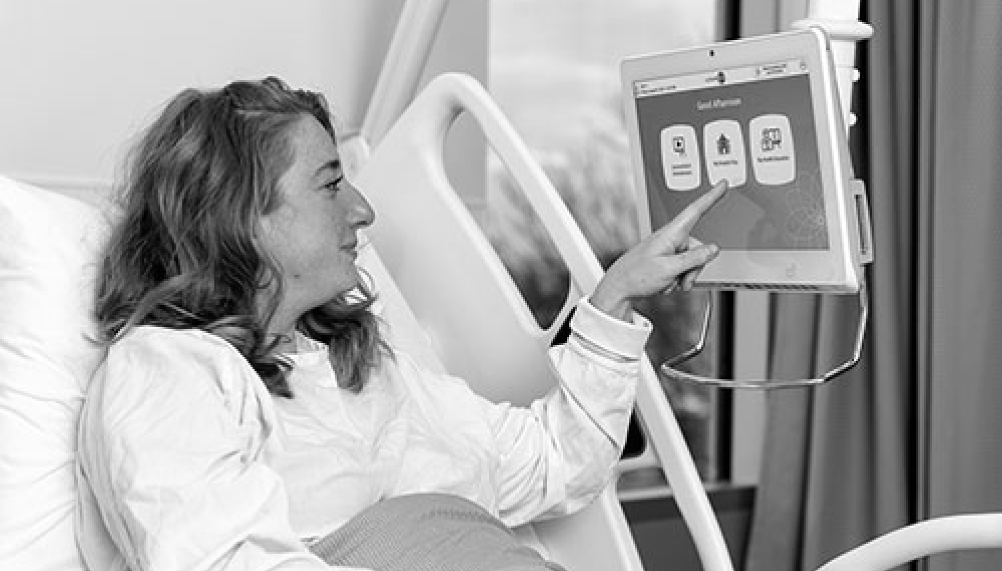
Online Order
Patients prefer talking to real humans
Patients believe that online orders have more errors
Patients think it feels emotionally distant
PROBLEM STATEMENT
How might we design a meal ordering experience for hospital patients, where NEON provides an interactive, empathetic, and efficient ordering experience?
Research
We prioritize users in every stage

SYNTHESIS
North Star principles
Let's dive into the actual design! I've anchored my decisions on these four principles. They guarantee that NEON not only distinguishes itself from existing software and solutions but also underscores the significance of a human-like interaction.
Voice Interaction
Avoid traditional mobile/tablet UI
Touch-free ordering process
UI acts as visual support
Prompt user to talk to NEON
Smooth User Flow
Send reminders to order food
Prompt users to interact with NEON by giving examples
Mimic the face-to-face ordering process with a real human
Empathetic Communication
Tone of voice customized for different types of patients
Warm & welcoming speech style
Companionship features
Premium Experience
Filter the menu by diet restrictions
Customization options
Personalized recommendations
Add special instructions
ITERATIONS
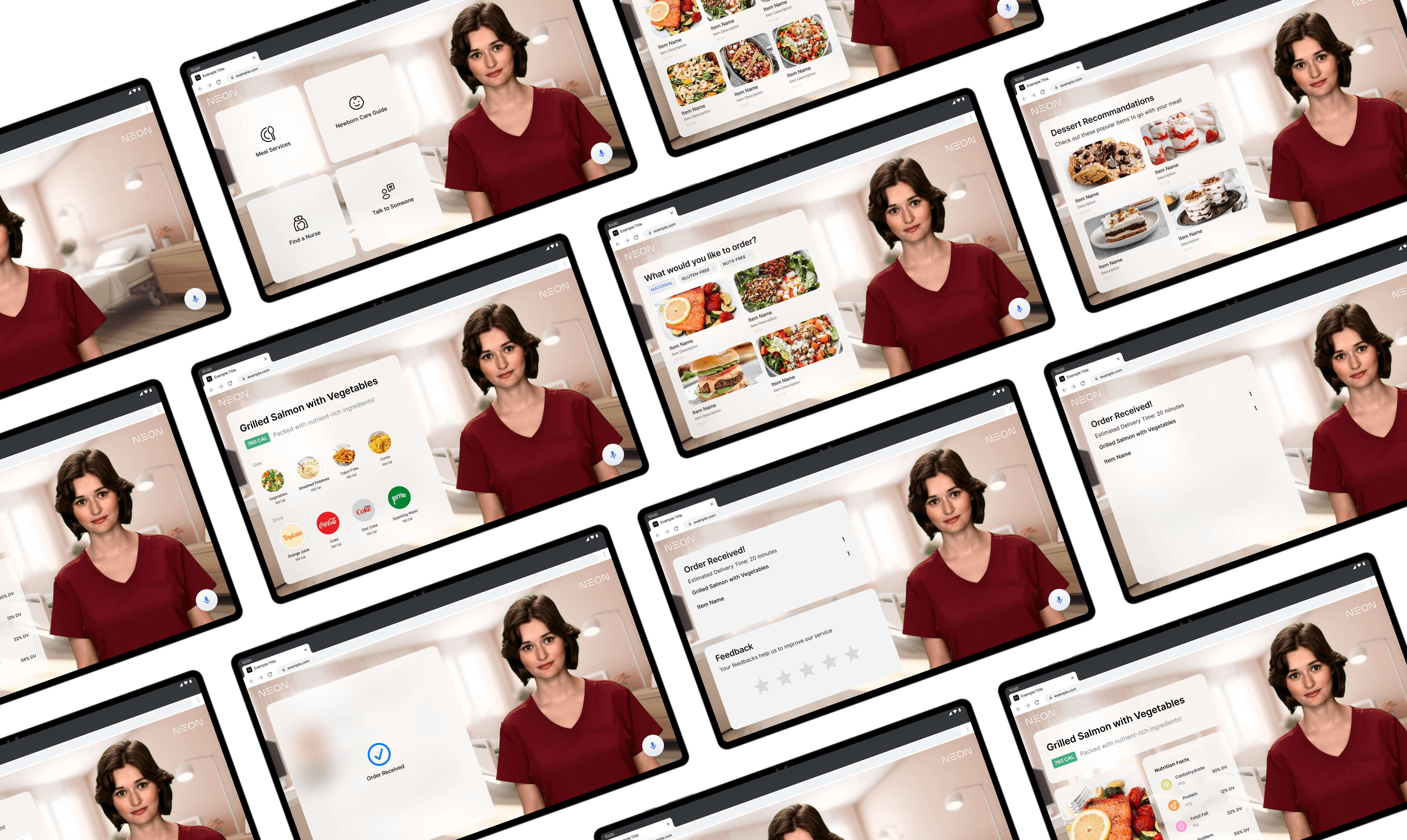
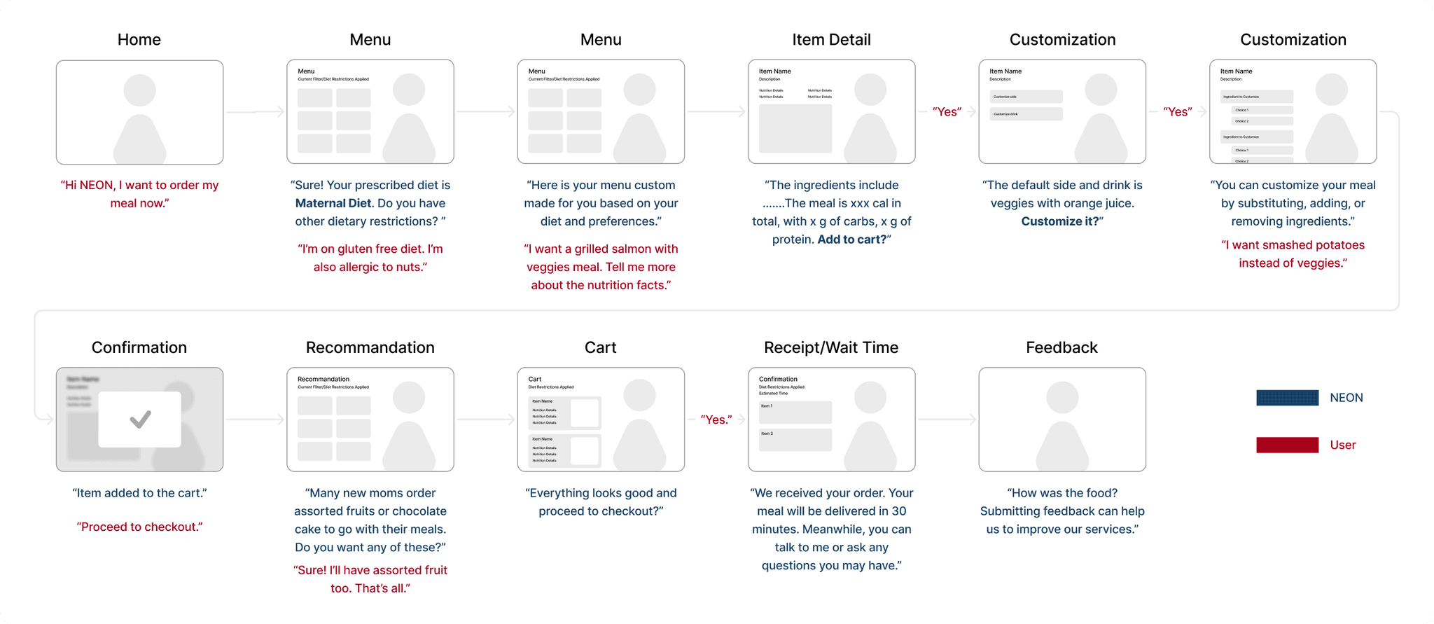
Low-fi mockups of the key screens
I crafted low-fidelity screens for pivotal moments in the process. Given the product's conversational nature, I incorporated the script; displaying the screen without the accompanying conversation wouldn't provide the full picture. This inclusion proved invaluable when presenting my progress to my manager for approval.
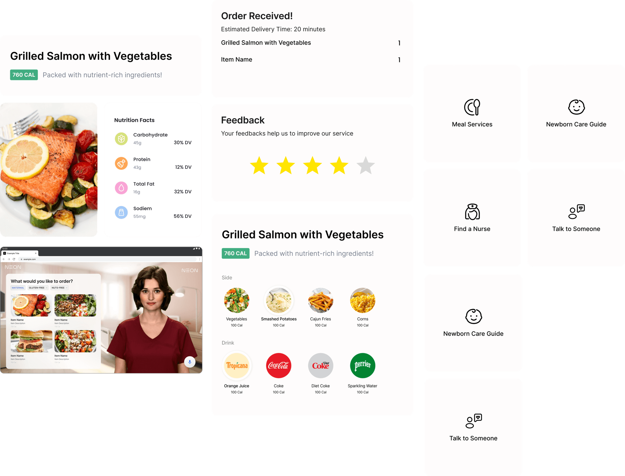
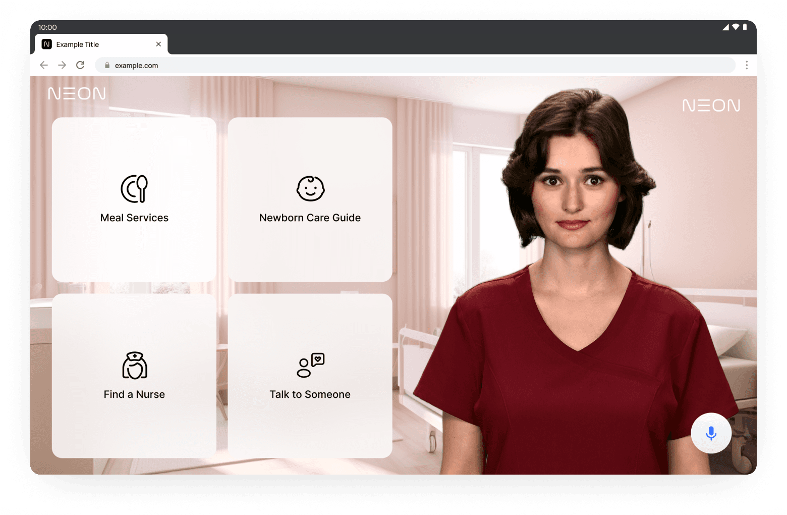
Final design
After receiving their valuable feedback, I took the time to once again brainstorm and thoroughly consider the user's perspective, allowing me to gain a deeper understanding of their needs and preferences and ultimately arrive at the final version of the design.
Click the buttons on the left to explore different modules of the homepage design.

